As a Principal and Lead UX Designer on Zynga Poker, I worked with the Product and Art teams to completely re-design a few key features to improve the overall player experience for this game that has delighted and engaged players for 19 years. There were many existing user patterns that needed to be updated and it was a great design problem to figure out what to prioritize first with a limited amount of bandwidth to dedicate to the work every quarter.

Stake Selector Redesign
In Zynga Poker, players select stakes using the Stake Selector. The old Stake Selector design utilized a scroll bar that the player scrubbed to increase or decrease stakes. The old design displayed existing feature bonus information all over the bottom of the screen and was sure to become extremely overwhelming with even more feature bonus content.
The new Stake Selector redesign included the following innovations:
○ Big tappable cards represent each stake and clearly announce the important bonus features available at each stake
○ Navigating between stakes is done through tapping cards on the side or scrubbing the whole screen
○ Additional bonus feature information is moved to the back of the stake and is accessible via the stake's FAQ button
○ Table Settings are moved to a pop up dialog accessible via Table Settings button
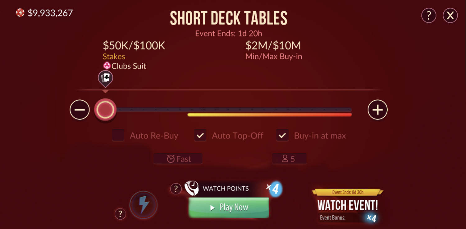
Old Stake Selector Design
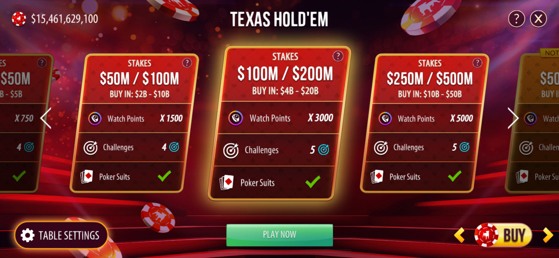
New Stake Selector Design
Card Design Iteration
To get to the final design, I iterated on a couple different design choices. I knew we wanted a big tappable stake card so I made a couple designs for how we'd organize information on it. We settled with the Row design as it gave us more horizontal space for text which is vital for localization with overflow feature bonus information on the back. Putting feature bonus information on the front and back of the stake card in a scrollable format allowed for scalability.
I also made distinct UI designs for when a stake was not selectable because the player didn't have enough chips and for when a stake was beyond a player's progression level.
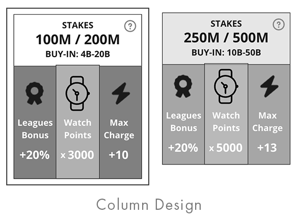
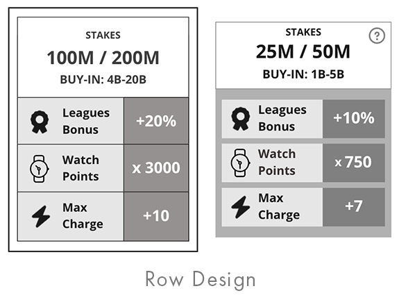
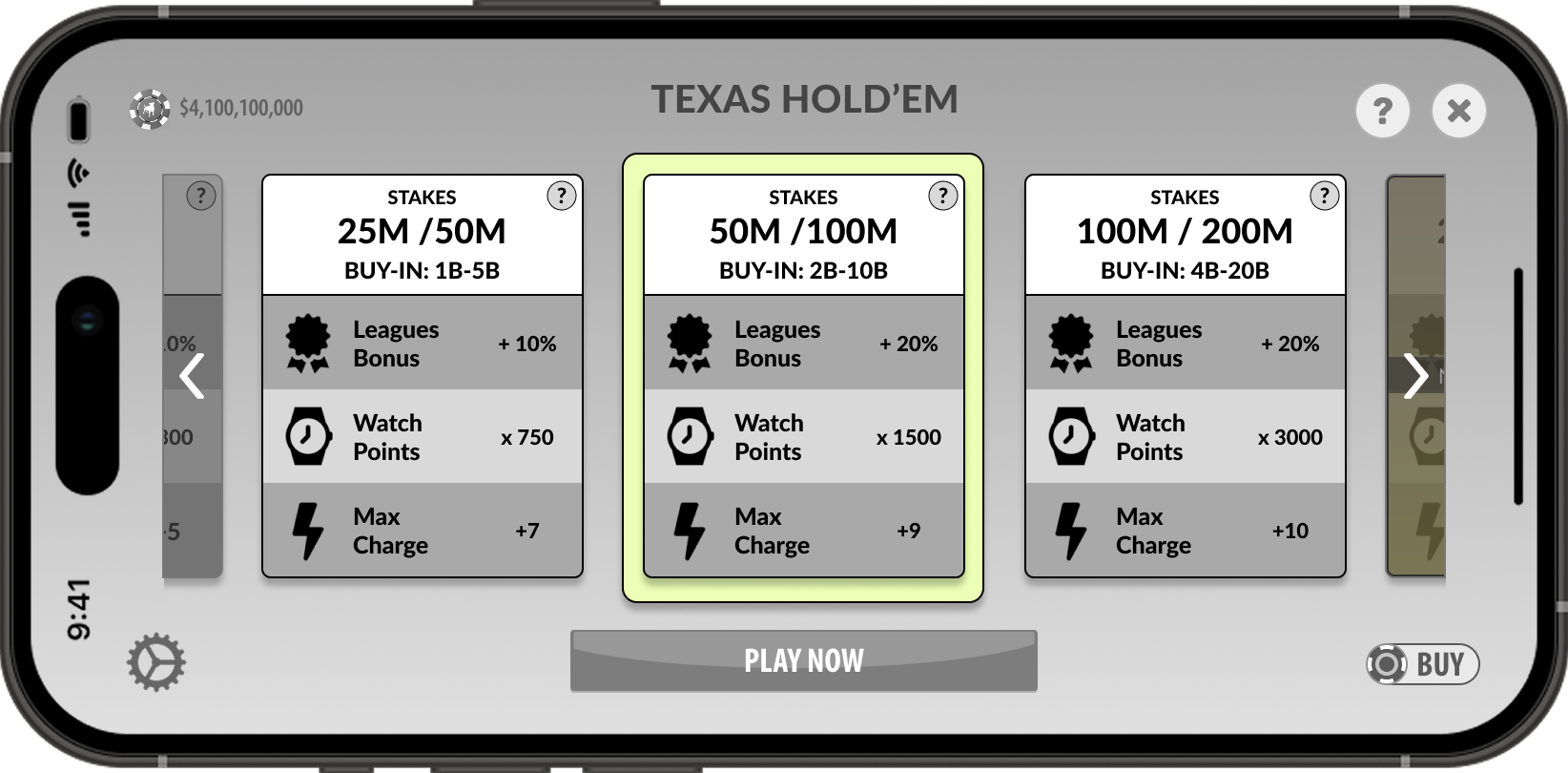
Final UX Design
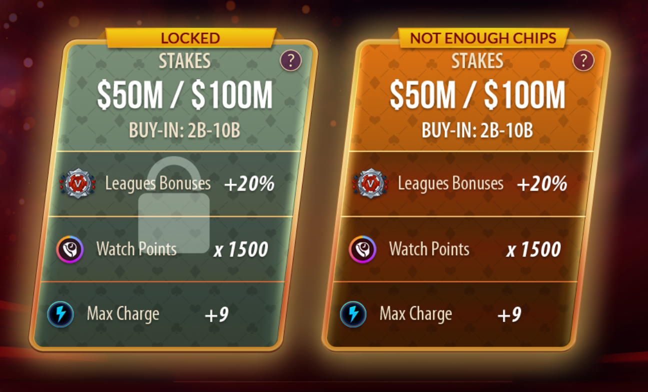
Stake Card Variants
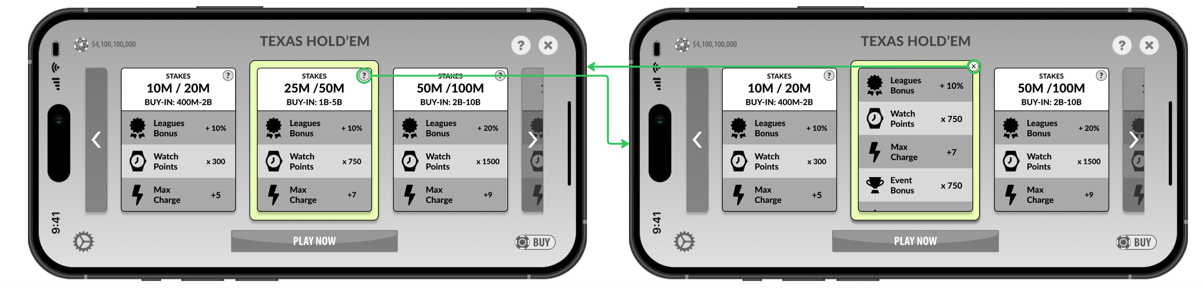
Stake Card Back showing Feature Bonus Information
Settings Menu
Adding a pop-up dialog to house the table settings also adding scalability for these options.
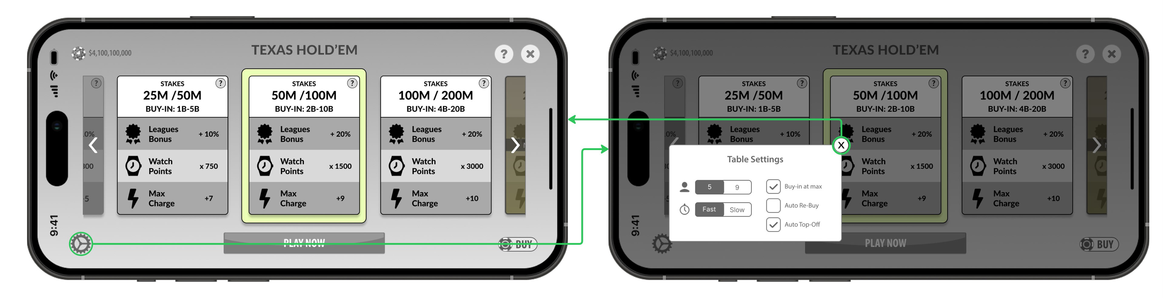
Settings Menu

Main Stake Selector Flow
Joker's Tower
I worked from UX concepts to final UI Art on a treasure tower mini game designed specifically to be a place where players would spend their gold, a currency that players had been collecting but not spending. Players could spend gold if they wanted extra chances to make it to the top of the treasure tower or if they wanted additional rewards.
Main Game Flow
In the tower game, the player is presented with 3 choices which can be prizes and one choice which can trigger a fail state that ends the game immediately unless the player pays out gold to continue. On Treasure Levels, which the player reaches every 5 levels, the player is safe from a fail state but can spend gold to pick another prize. These Treasure Levels incentivize players to keep progressing.
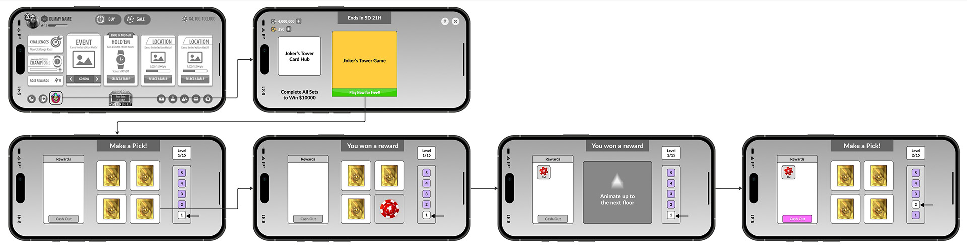
Main Game Flow

Treasure Level Flow with gold spend option for additional reward
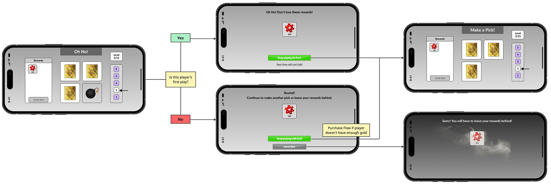
Fail Flow with gold spend option to continue
Card Collection Hub
This feature includes a set of card collections that can only be collected through the tower game.

Final UI Art
I collaborated with the Art team on generating UI art assets and background art that fit together thematically for the main game hub, the card collection hub and the treasure tower game.
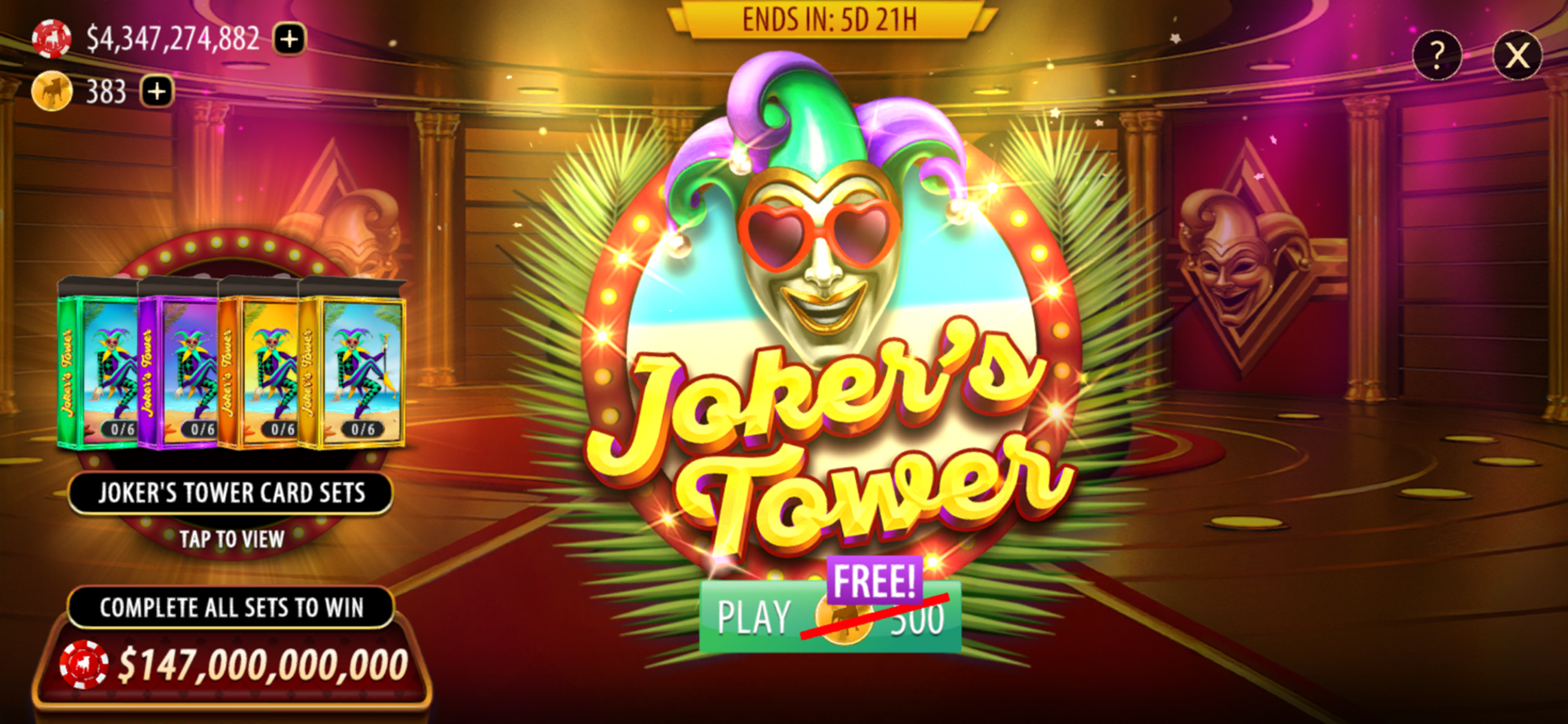
Main Game Hub
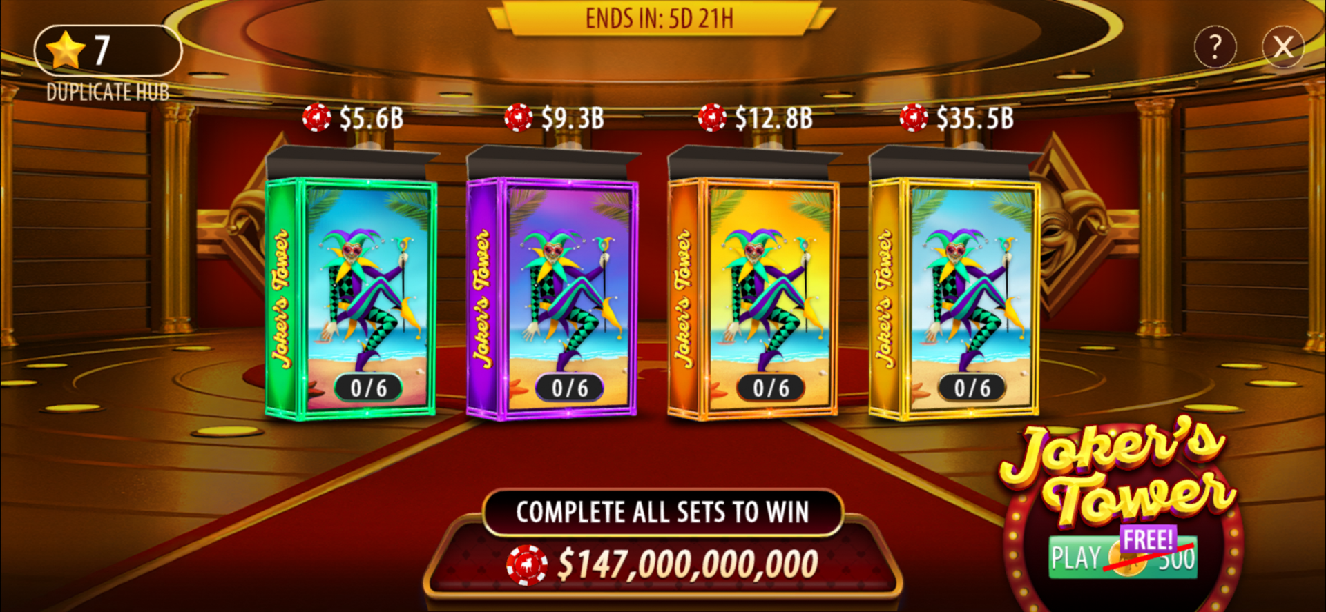
Card Collection Hub
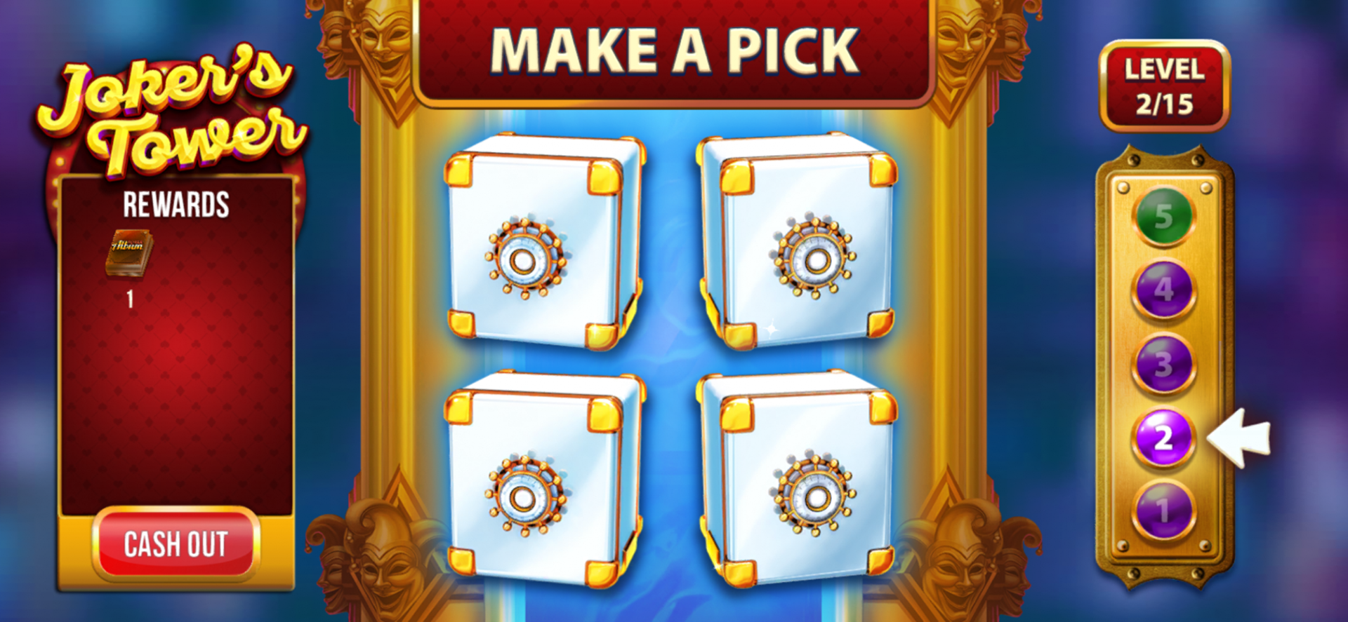
Treasure Tower Game