KSP2 is easily the most complex user experience I've ever worked on. My work ranged from designing essential navigational game menus to highly specialized interfaces for tools that help players build rockets better and fly them further. I grew so much as a UX Designer doing this work and am forever grateful for the opportunity to design user experiences for players of the most realistic space flight simulation game in existence.
For the features that I'm detailing here I owned the entire UX/UI Design process which includes:
○ Detailing out and verifying the feature's user stories with the product owner and additional stakeholders
○ Creating an interactive prototype or animation example so all stakeholders can agree on the scope involved
○ Calling out the feature components (toggles, sliders) and the Unity prefabs to build out the in game implementation
○ Taking multiple visual passes on the in game implementation and iterating based on playtest feedback
Frontend Menus
User Flow Map
I started out the Frontend Menu flow process by mapping out the entire flow which starts from the moment the player boots up the game. I also mapped out player paths that we didn't plan on shipping at the time but would still need to have the hooks in place for the future. This included mapping out how a player would need to create a Private Division account to be able to access Multiplayer mode. With this Frontend menu map in place, Engineering was able to build on the foundation that we would skin our UI on.
Main Frontend Flow
Multiplayer Frontend Flow
Single Player Campaign User Flow
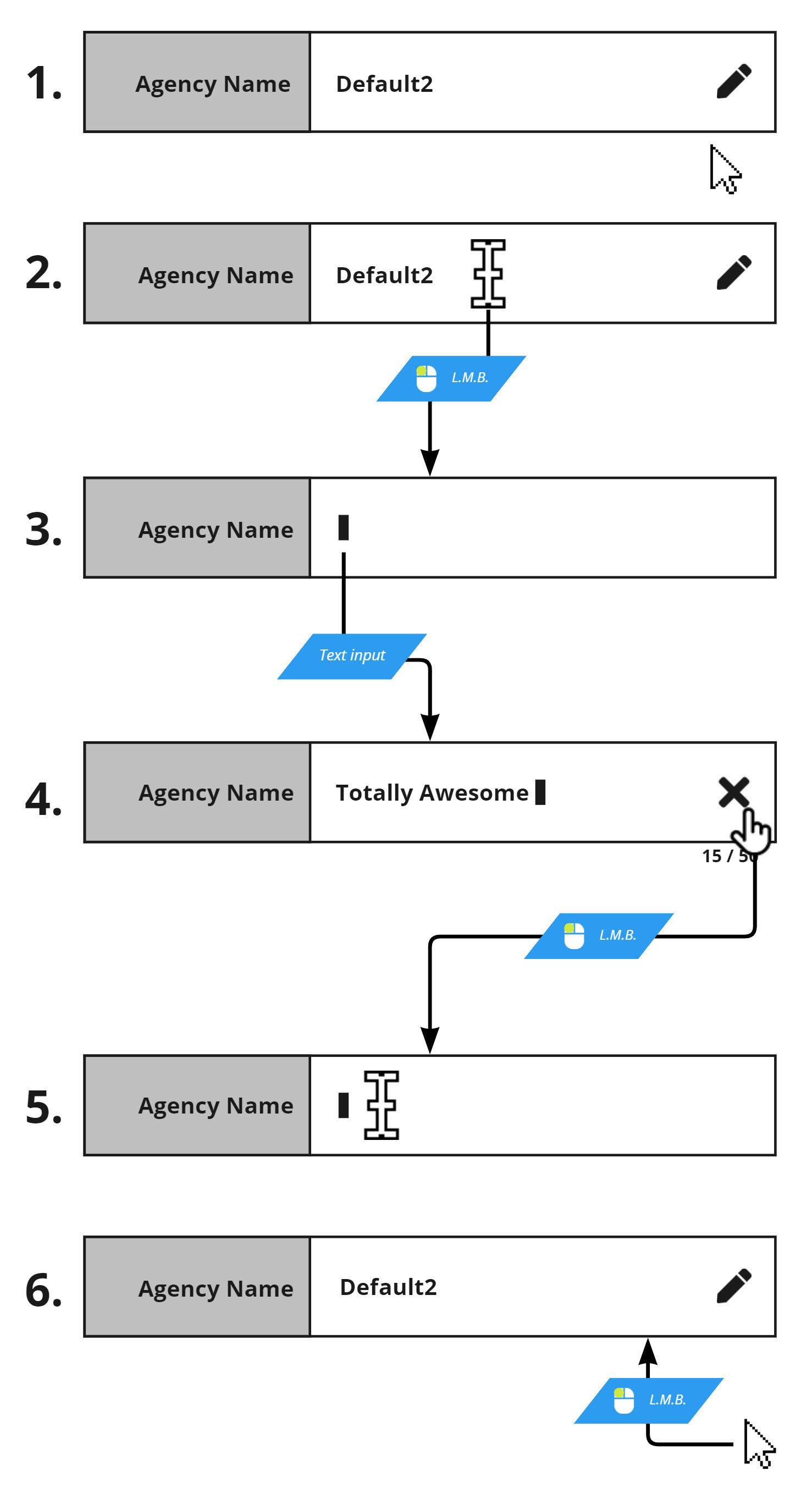
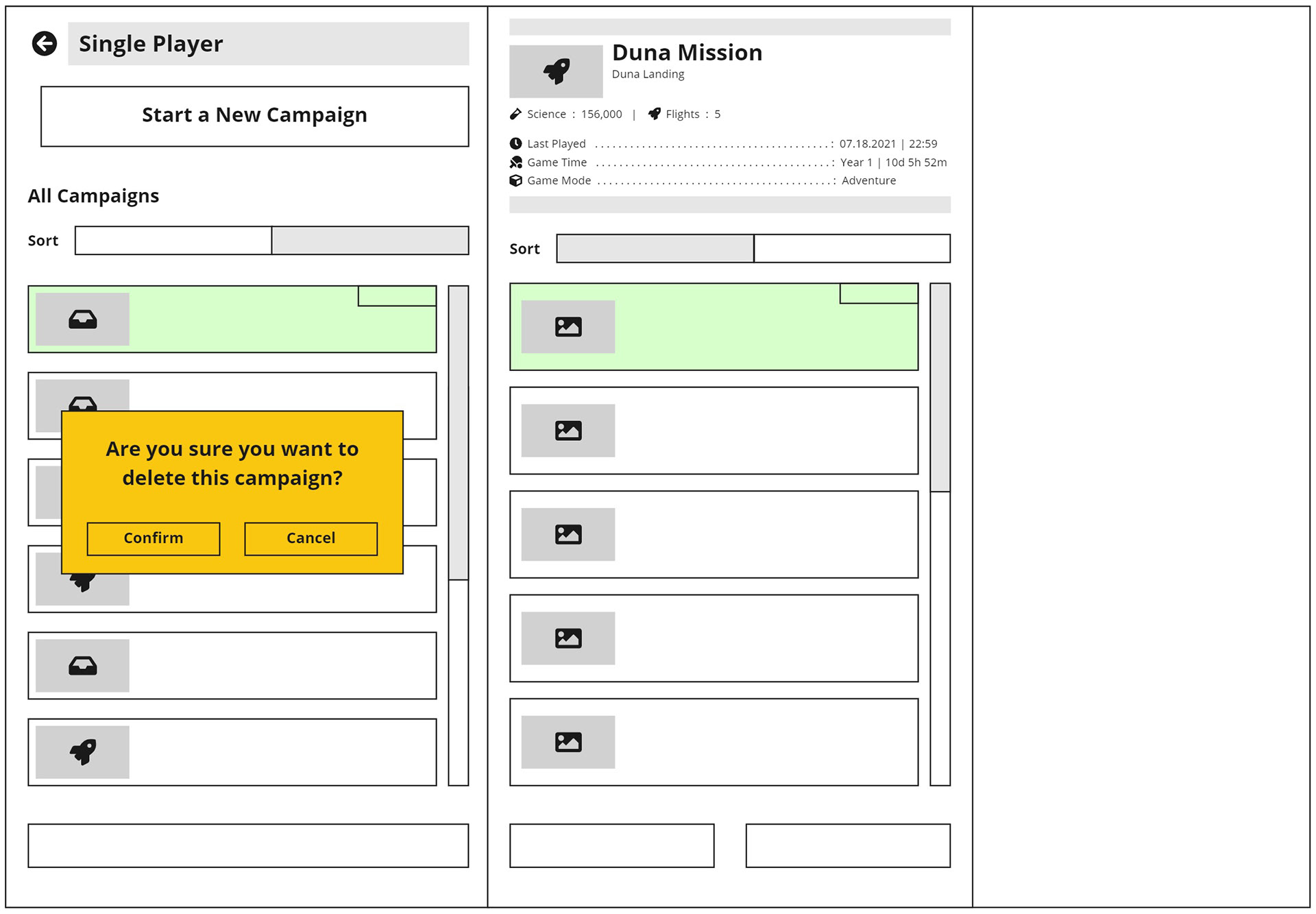
At this point, I created user flows to show how the player would start a new single player campaign or load an existing campaign. I also created user flows for all related smaller user flows such as campaign name text entry and campaign deletion.
Single Player New Campaign Screen Flow
Single Player Load Campaign Save Flow


Single Player Campaign Animation
I created an animation example so that Design, Production and Engineering could have a clear example of how the menu flow should look. Engineering was able to implement the animation based on this example. I created all the visual components in Figma and then animated them in After Effects.
New Campaign Flow Animation
UI Style Iteration
After I implemented the frontend menu components in the initial style as shown in the above example, our team decided to switch to a new UI style so we re-skinned our UI prefab toolkit (buttons, toggles, sliders). With the re-skinned toolkit, I was able to re-skin the frontend menus easily and quickly.
Campaign Saves Menu - Final Implementation
New Campaign Menu - Final Implementation
Tech Tree
Planning and Prototypes
I worked with a product lead on developing a new tech tree for KSP2 that would be based on a main progression trunk that players would always have access to so they would never find themselves in a corner they couldn't progress out of. With this user story as the foundation for the tech tree, I built a list of other requirements to resolve.
I wanted to solve the problem of porting to different screen sizes at the start so I presented the idea of paginated tiers implemented as groups of nodes on a wide canvas accessed by a top row of toggles mapped to the page coordinates. This implementation removed any need for zooming in or out and we could also show some parallax animation in the background. Players can use the tier toggles, the horizontal slider bar or keybinds to move across the tree.
I built a first prototype to demonstrate tier toggles, a horizontal slider bar and the simple tech node purchase flow and then built a second prototype to demonstrate a tier unlock flair animation.
Prototype 1 - Tech Node Purchase
Prototype 2 - Tier Unlock Flair Animation
Visual Design
With the main tech tree design approved by all stakeholders, I went on to create the finalized UI assets which included the tech nodes, tier toggles and background panels. I pitched the idea of the background image being a wide unbroken image with each tier's specific background image being the planet that the player can expect to reach with that tier's unlocked parts.
Final UI Mock Up
Tech Node Interaction States
Tech Node Variants showing rewarded part categories
Tier Toggle Interaction States
Information Panel - Game States
Reward Animations
After Engineering set up the basic implementation, I re-skinned with the final art assets and then implemented additional improvements that we learned were user needs after playtesting. These included tech node costs, purchase animations and the player's currency balance in the Information Panel. To save on time and resources, I edited previously created animations from our tutorials to use as the Tier Unlock animations. This video shows the implementation of the tech tree that we shipped with.
Tier Unlock Progression Reward Flair
Delta-v Tool
Planning and Prototypes
The Delta-v Tool is a tool that allows players to see how much Delta-V each stage of their rocket has in unique flight situations. My product designer and I agreed on the solution of a modal that the player could interact with to edit the flight situation settings for each rocket stage. The resulting information would be shown in each rocket stage and I faced the design challenge of cramming this new information into rocket stages that already contained a lot of information. My solution was to create a 3 state toggle that allowed the player to decided what information they wanted to prioritize and see at any given time.
Since this feature would be added to a scene with an already established visual UI language, I quickly made final art assets for the Delta-V Tool modal and the stage expansion that matched the staging stack and used those to prototype the interaction. After the prototype was approved by all stakeholders, I met with Engineering to go over the specifics of the interactions in my documentation. After the feature was implemented, I added final visual polish in game. The final implementation we shipped with did not change much from the prototype presented here.
Prototype Link
Toggling between information states
Deploying the Delta-V Tool
Documentation
I created documentation to further clarify the intended player interaction.
Deploying the Delta-v tool per rocket stage
Delta-v Tool Component Breakdown
Launch Location Menu
The launch location menu is a menu through which the player chooses the launchpad to launch their rockets from. In its previous iteration, this menu was tucked away as a dropdown menu in the header and was not easily discovered.
Through playtesting, we made the decision to present the Launch Location menu as an ever present toggle button above the Launch button. Now, players had a better chance to see it and associate its function with the Launch button.
Final Launch Location Menu Implementation
Launch Location mock up
Logic flow for launch location selection defaulting
Cheat Menu
With how easy it can be to end up with abandoned crew scattered across the Kerbolar system, we decided to ship a player facing version of our Debug Menu as soon as we could. With the Cheat Menu, players could easily teleport to the furthest planet to rescue their crew or perfect their landing technique on a rocky surface.
We wanted the menu to be useful to a wide range of player skill levels. To help beginner players from accidentally slamming into a surface during an orbital teleport, the default orbital teleport mode sliders snap into a bound value range. For advanced players more sure of themselves, they can toggle off the safety bound range and input any value they want.